
Project: Redline Employee IT Platform
Role: User Experience Architect (Design Lead)
“Redline” is placeholder name for an enterprise-scale healthcare client I worked for. The Redline IT portal is where employees receive help for all things hardware, software, network, and data related.
While Redline has a massive and growing user-base at over 80,000 users, it regularly received negative feedback on usability, fundability, and aesthetics from employees.

Usability Audit
We performed an presented an in-depth analysis of the entire existing site, through the lens of Usability best-practices.

User Interviews
Our first objective was to speak in-depth with a variety of users from different departments, including IT, HR, New Hires, and General Employees.
Insights were collated into a report for the client, revealing patterns, gaps, and opportunities.
Personas
We synthesized the data from the user interviews into Personas, a key part of our design process, which helps us understand and empathize with the user segments. Below is one example.

Employee Journey Mapping
It was important to understand and visualize all steps of the employee journey in receiving resupport. Journey Mapping helps shed light on what is working well vs. problem areas and opportunities.


Need-finding Survey
In parallel with interviews, to elicit a better sense of current awareness, usage, preferences, and issues faced, we sent out a survey to around 300 employees. I used excel to clean the data and an interactive data tool called Tableau to visualize the results, sifting for insights.

Service Blueprinting
Considering the platform through the lens of Service Design was important in fully extrapolating all touch points for the employee throughout their journey receiving, tracking, and resolving support issues.

Wireframing
I conducted multiple remote, collaborative ideation sessions with the customer, directly in Miro to refine opportunities.
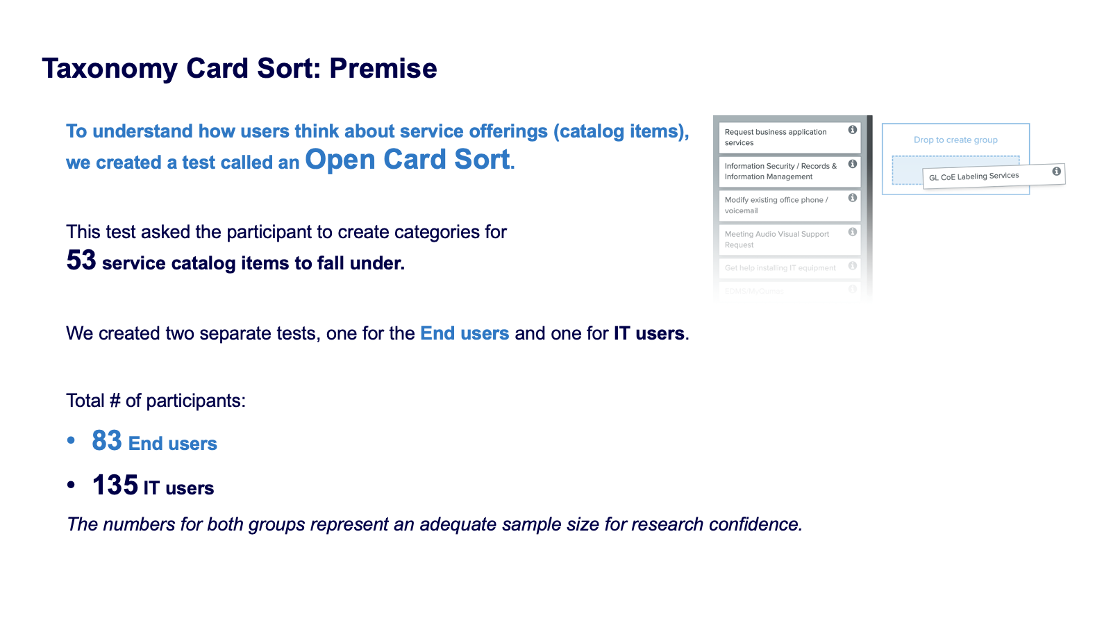
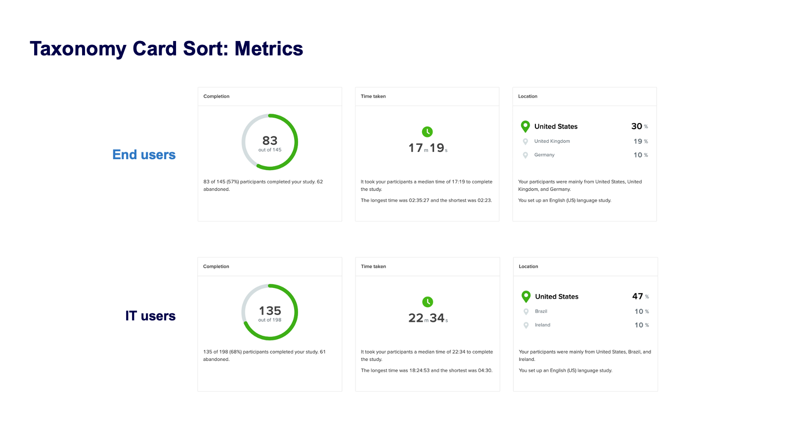
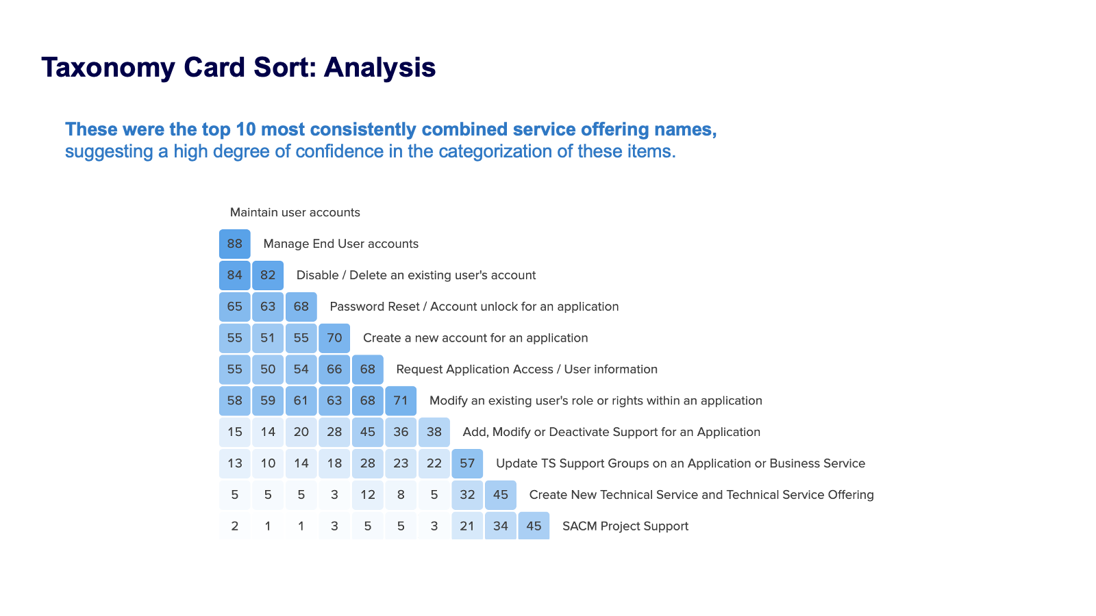
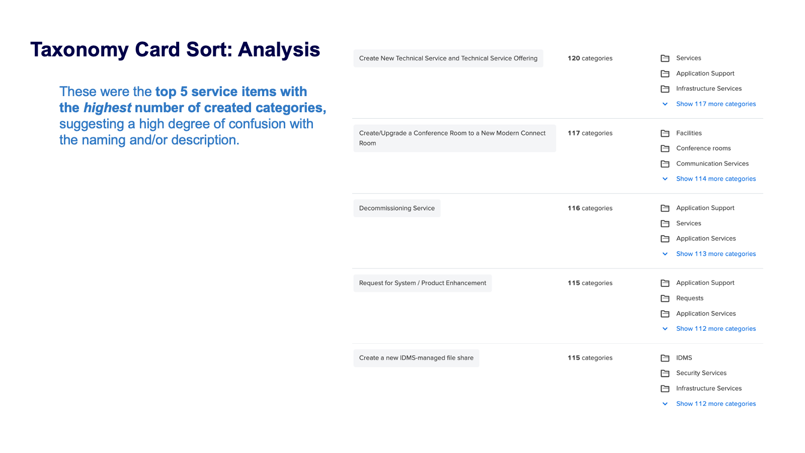
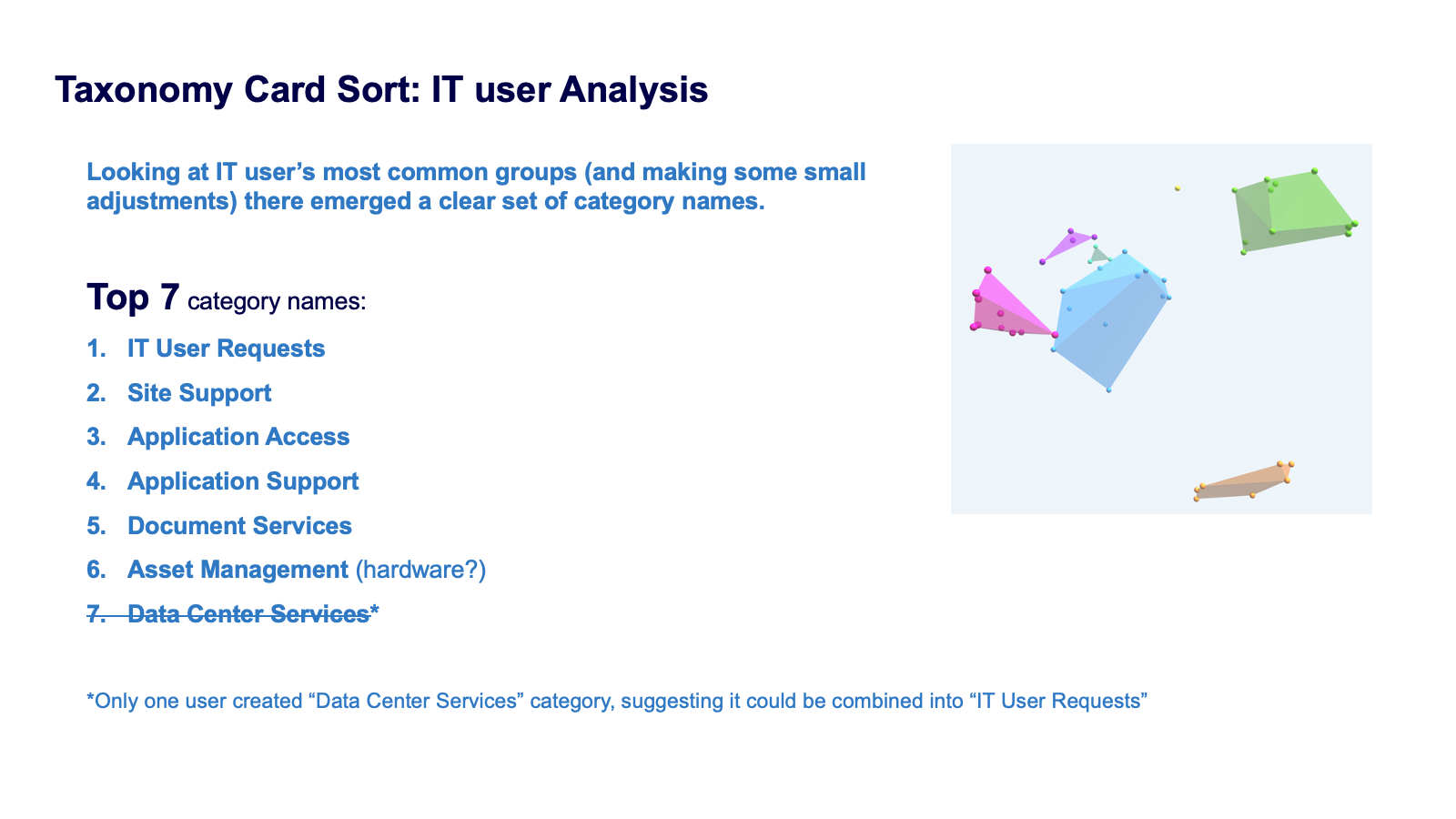
Taxonomy Card Sort
A key component of users finding correct/relevant information has to do with how information is organized and categorized within menu’s. To address this, we used an industry-proven method called an “open card sort” to let users both create named groups for existing services.
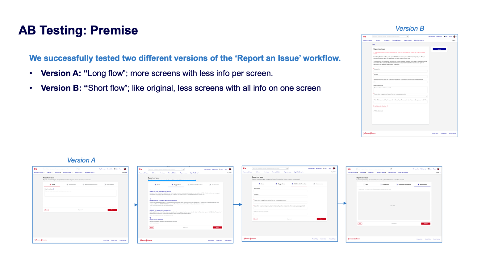
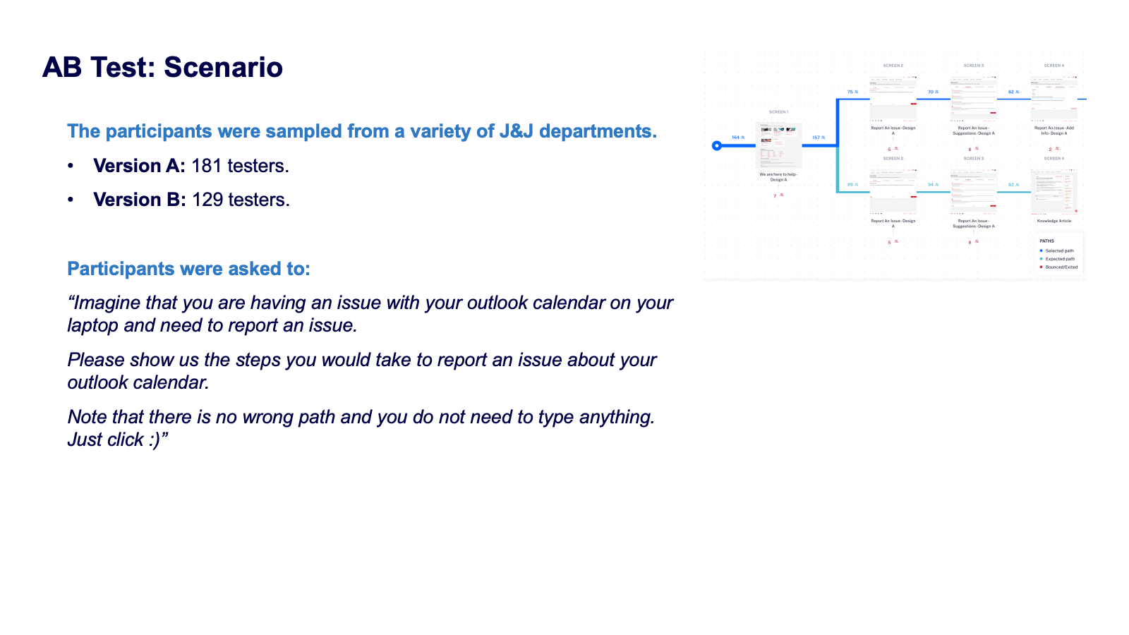
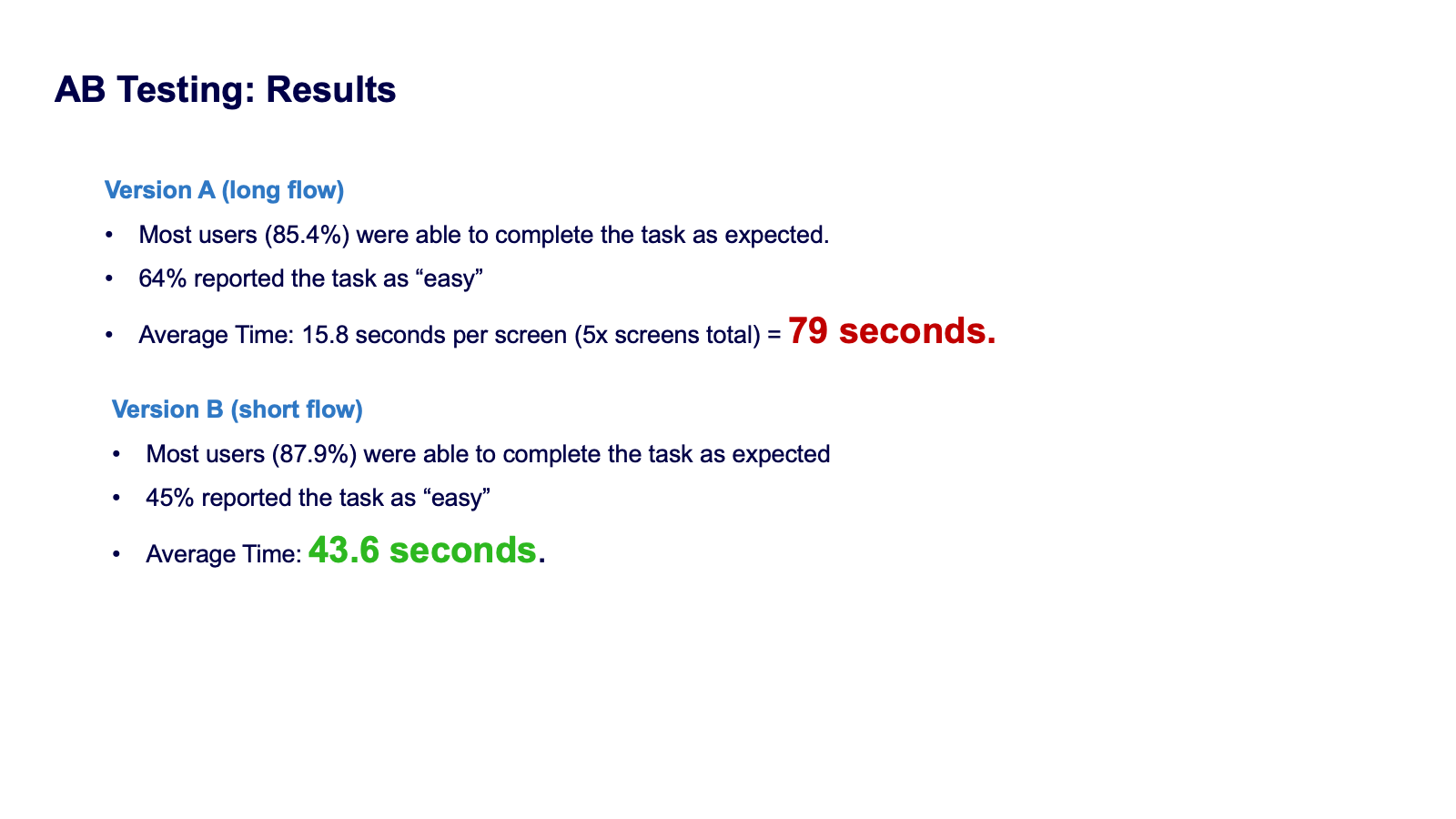
AB Testing
We tested two versions of the user flow to “report an issue”, a “short” single page interaction vs a “long” wizard-style flow. Because the long flow costed users nearly double the amount of time as the short-flow, the decision was made was to keep it short.
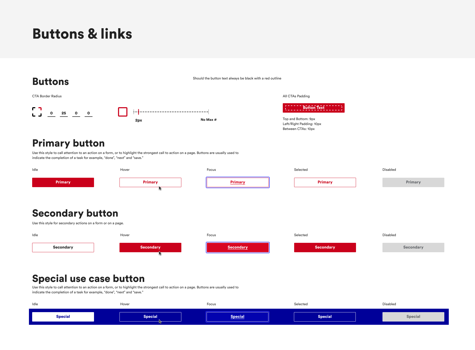
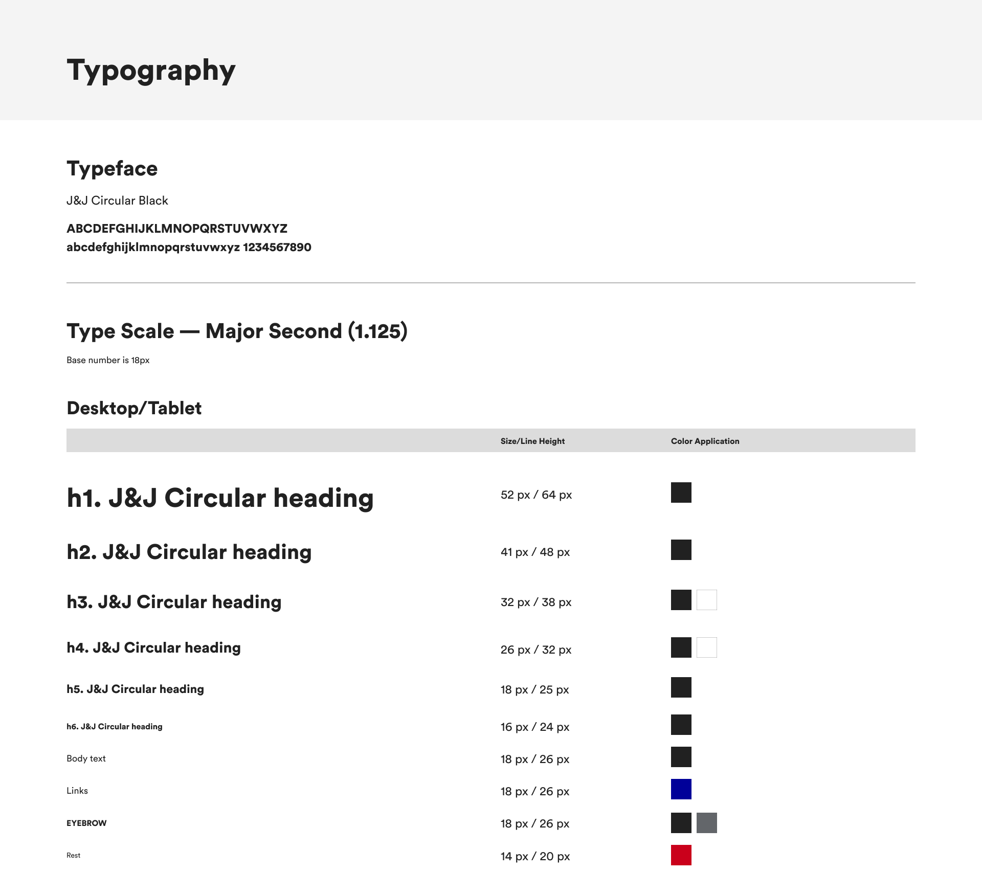
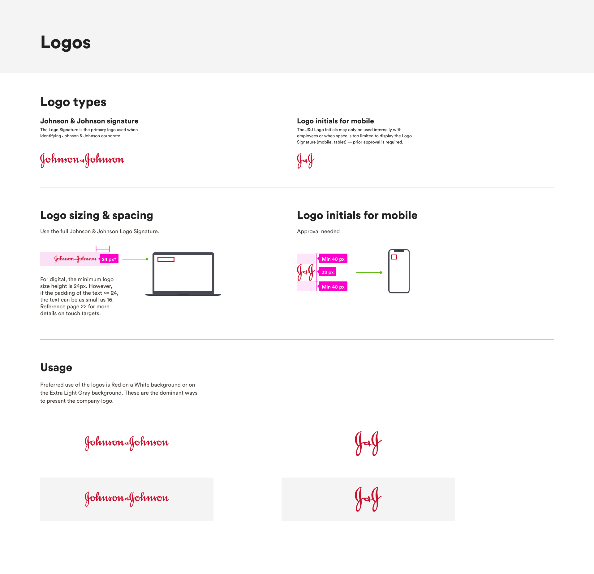
Design System Creation
A ServiceNow-focused design system was created in Figma based off brand guidelines, containing hundreds of reusable components.
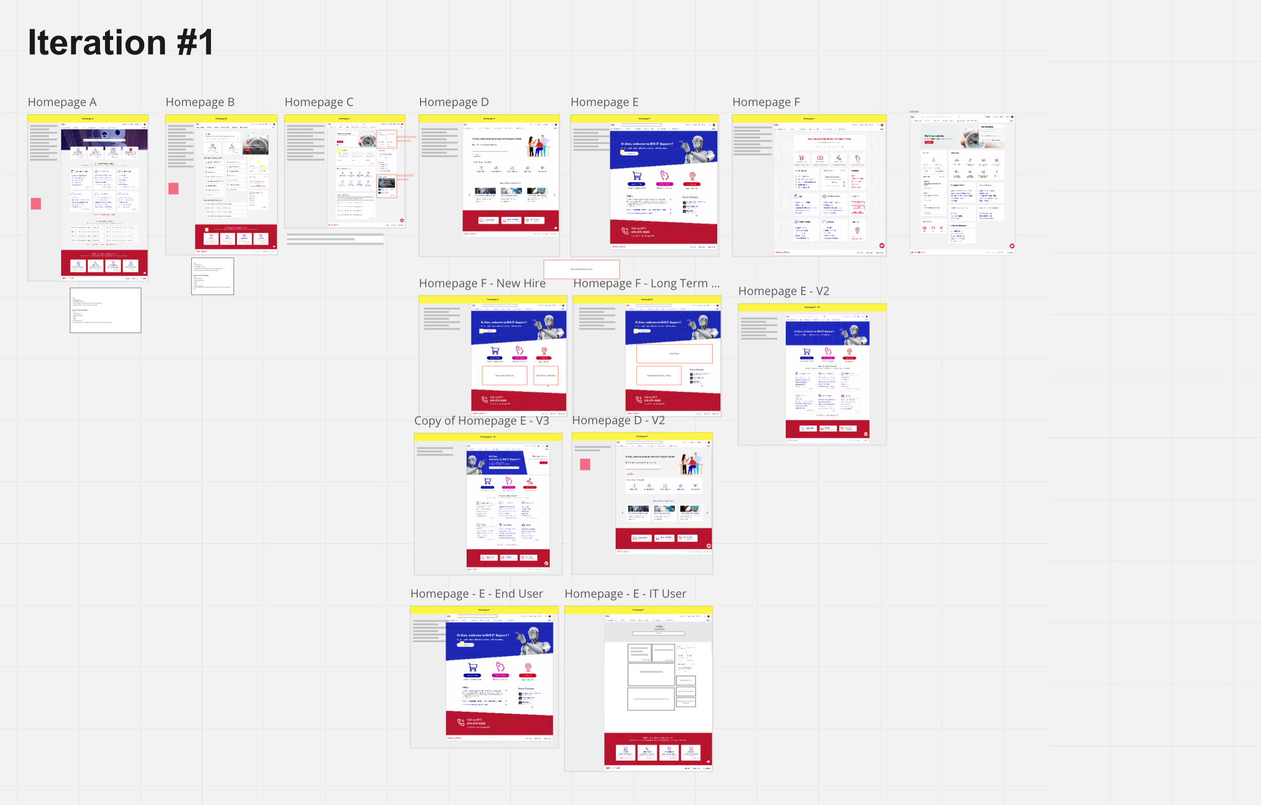
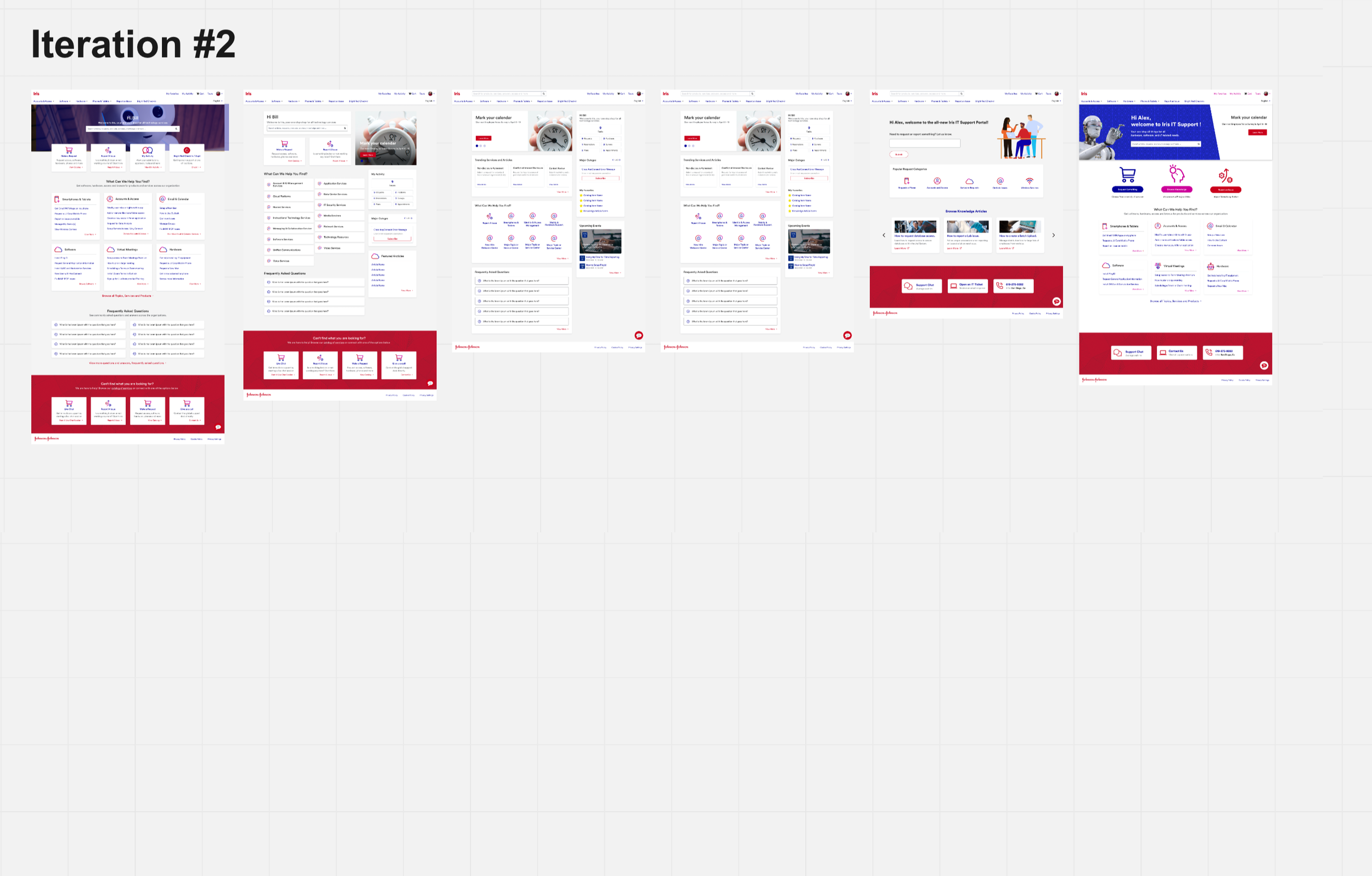
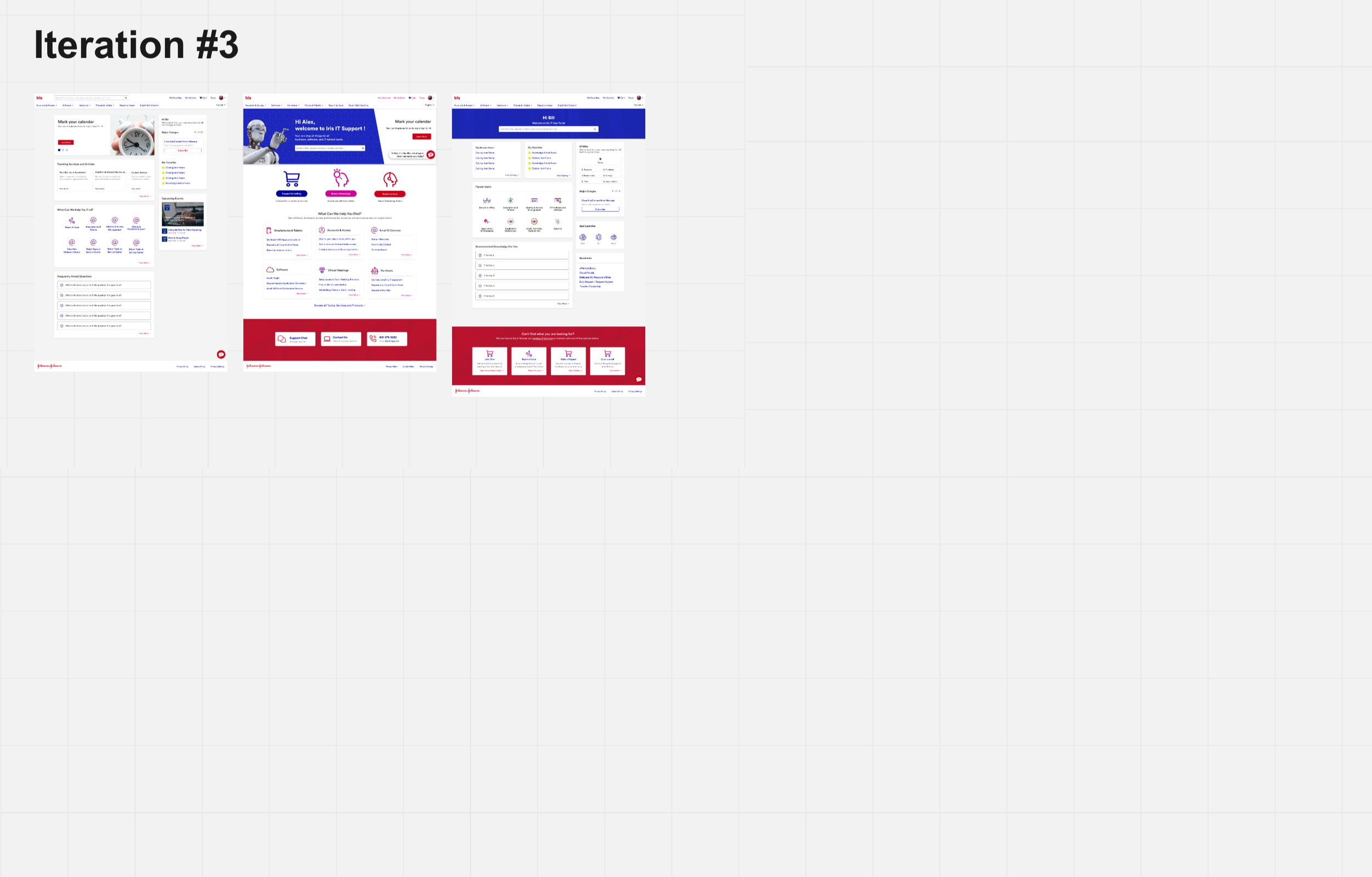
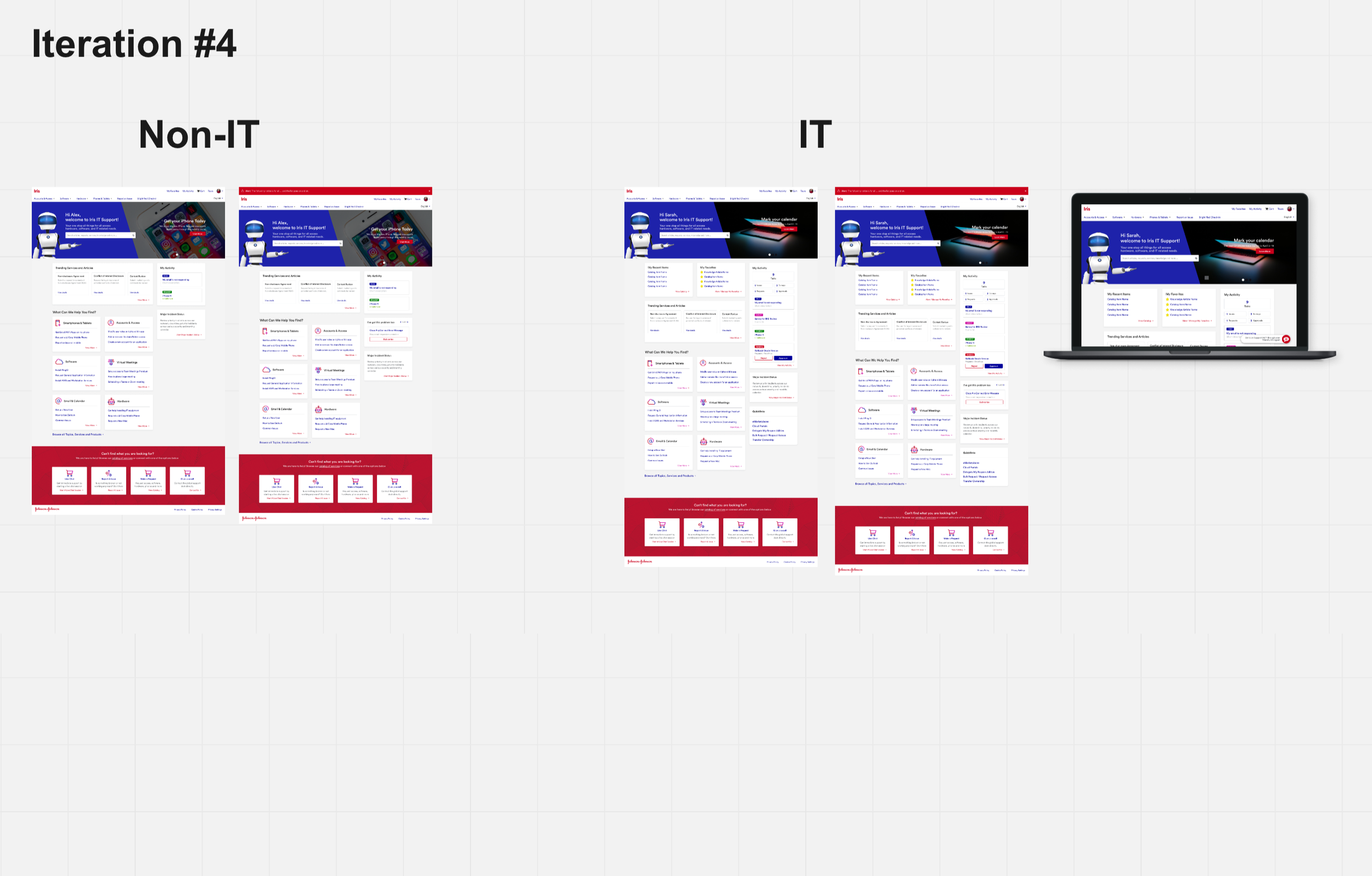
Multiple Iterations
Our team worked in an iterative capacity, collaborating with the client and users during workshops to evolve the design.
Final Concept
The final design design has seen an improvement in user satisfaction surveys from 36% to 56%, with most users reporting the portal “easy to use”, “quick to find things,” and “modern-feeling.”

First Click Testing
We also tested new design prototypes against the original site, to validate, measure different KPI’s, and ensure users were getting to relevant information or services quickly.